Tuesday, January 29, 2013

Photo inspiration

During a quick visit home, I took this in my backyard. Illinois is not the most scenic of all states, but it's dear to me. I like this photo because there's repetition in the trees and shadows.
 

You can't miss: Hans Sachs poster auction

Eye Magazine's blog did a fascinating post on Dr. Hansa Sachs, a German dentist who collected French and German posters of the late 19th and early 20th centuries. His collection includes posters from artists like Toulouse-Lautrec, Jules Chéret, Alphonse Mucha, Théophile Steinlen, Pierre Bonnard, and Thomas Theodor Heine. Google any of these names and you will see some stunning art, perfect for design or typography inspiration. Toulouse-Lautrec's posters are particularly stunning, and as expected, he depicts his favorite subjects: dancers. And, yes, there are some for the Moulin Rouge.
File:Lautrec moulin rouge, la goulue (poster) 1891.jpg
(Photo found on wikimedia commons)

Sachs was a successful dentist, but his heart was in poster-collecting, and he truly had an eye for it. The Eye's blog post said Sachs' collection reached 18,000 by the 1930s. After narrowly escaping Nazi Germany and fleeing to the U.S., Sachs' collection was lost forever, or so he thought. Nazis had confiscated the posters, and just last year, 3,000 were returned to Sachs' son. The beautiful posters are now going to be sold at an auction in New York. Here is another Eye Magazine post on Sachs.

While many of Sachs' posters were lost, I still think it's heartening that 3,000 were found. Sachs was truly a man devoted to art and design.

Response to a reading: iPad Design Lab

iPad Design Lab by Mario Garcia has valuable information on designing apps for tablets. I like the idea of creating something that allows the reader to interact. There's sort of a playful tone about app-designing that you don't really get with other types of design. Perhaps it's because you are thinking in terms of touch and interactivity, opening up all sorts of design possibilities. On the other side, there's something that just feels nice and satisfying when you're clicking on an app and more information pops up. As Garcia says, "The tablet user wants to be surprised." The user also wants a "lean-forward" experience instead of a "lean-backward" experience. To me, this means that design and content have to be catchy and to-the-point.

The "lean-forward" experience is subject to debate among journalists. Some aren't happy that long form journalism seems to be dying out, while "lean-forward" journalism is getting more and more popular. The average length of a news story is shortening to at least half of what it used to be. Is there a place in journalism for both "lean-forward" and "lean-back"? Maybe iPad apps are a sort of solution to this question. The iPad is clearly best suited for "lean-forward," so maybe it will be the home of short and pithy content. In any case, I think long-form journalism will always have an audience.

Critique of work from this week

I was really excited when we were assigned a photostory design in my design capstone class. My aim was to keep my design subdued and simple so I didn't detract or distract from the beautiful photos. On another note, I enjoyed working with these photos quite a bit. The photographer, Hayley Bartels, had incredible access. By looking through these photos, you can tell she took time to know this family and cared about telling an accurate story.

Critique began by looking at covers. My cover was sorely underdone, and that's something I'm going to spend time remedying before it's placed in my portfolio. I do like my photo choice, however, because it alludes to Ryleigh's disorder and shows the relationship with her mother (or physical therapist? I wasn't sure. Both people are devoted to her care in different ways, so it's the same takeaway).


Next came the first spread. Typography is not my strong-point. I went with an italicized serif for sentimental appeal, and I used green in the semi-transparent box behind the title for a pop of color. In this spread, I wanted to establish Ryleigh's family.


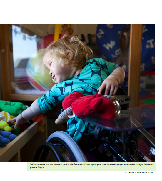
 Here is the second spread. This is the page that looks at Ryleigh's disorder a little closer. It shows the characteristic turned-in feet of spina bifida, as well as Ryleigh's struggle to reach for things from her wheelchair.

This is the third and final spread. I wanted to show Ryleigh's normal life at home and socializing. 


Today's critique was a useful time for me, and I took many notes on things I should change. I found the debate on the photo showing Ryleigh's back really interesting. Before laying out my spreads, I asked a photographer friend what she thought of the photo, and she recommended that I didn't run it. She thought it would sensationalize the topic, as we discussed in class. However, after hearing people say they wanted a visual of the disorder, I would reconsider running it small and on the second or third spread. I think it's important to discuss ethical arguments like this because the situation varies, and discussing your reasons for running or not running a photo can help you make decisions in future designs.