Tuesday, April 30, 2013

You Can't Miss: the Pick Me Up Festival

Eye Magazine's blog posted about the Pick Me Up Festival in London's Somerset House. According to the article, the festival is "a mixture of international illustrators, graphic novelists, cartoonists and graphic designers.

Check it out.


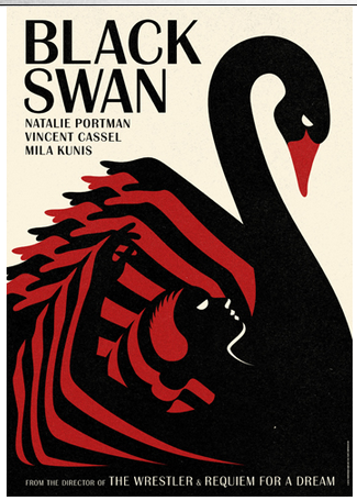
Rob Flowers' art will be featured at the festival. 
Here is one of his Illustrations, courtesy of Eye Magazine's blog.

Wednesday, April 24, 2013

Earth Day Photo Inspiration

In late tribute to Earth Day, here is a photo of the Bullitt Center in Seattle. The building, which opened two days ago, will have to "pass a year of auditing to prove compliance with a set of rigorous sustainability standards, including self-sufficiency in energy and water" in order to pass the Living Building Challenge.

Photo and information found on http://news.nationalgeographic.com/news/2013/04/pictures/130419-extreme-green-building/#/earth-day-green-buildings-bullitt_66483_600x450.jpg

Picture of Bullitt Center green living building in Seattle

Response: Websites

We looked at each others' sites for the first time on Tuesday, along with our first drafts of portfolios. 

There was a lot of variation in style and tone on the sites, and it definitely helped inspire me to make some changes on my own site, http://cargocollective.com/feliciagreiff. I recently upgraded my site, and I intend on learning some CSS to get me to a more finished, polished look. Since yesterday, I have added my logo (a work in progress). 

I began thinking about what employers are looking for when they peruse designers' sites. I'm sure the most important part is that the work is easy to get to and see, but there are other concerns like branding and style. As this is my first site draft, it is low on style for now. But in the next few months, I'm going to develop it and hopefully get it to a place that makes me really stand out.

Critique: Portfolios

On Tuesday we looked at each other's outlines for print portfolios. The examples I saw looked like they were definitely on the path to being professional, sleek books. My mockup was very rough, but I received some helpful tips as well.

Being in a class of twenty-some designers is incredibly helpful when you are planning your first print portfolio, as I am. Who better to critique and look at your designs and layouts of your work than your classmates, who are all in the same boat?

Here are some things that struck me as important:

1) Put your designs in context of the project they came from, and explain why you included it.

2) Let everything breath by including a few white pages and splash pages.

3) Tease to your website or contact info somewhere in the book.

And, of course, use high-res!

You Can't Miss: La Boca

Eye Magazine recently did a profile on "La Boca," a London-based design company that is celebrating its tenth anniversary in Nantes, France. The exhibition celebrating the colorful designs of the company is called ‘Graphisme Utopique, Architecture Radicale.' 

Here are a couple of samples from La Boca, including its famous takes on "Black Swan." These images are from La Boca's website, http://site.laboca.co.uk/. It is definitely worth a look!


Wednesday, April 17, 2013

Response: Presentations

Our class presentations have made me wonder about magazines that have recently redesigned. It's a part of the magazine industry that occasionally gets vilified, but it's necessary.

Other than the New Yorker's rebranding, I wasn't really informed about other magazines that have recently undergone changes. Good Housekeeping and Bloomberg Businessweek have redone their mastheads, but what else?

It seems Ebony, The Atlantic, Self, and The New Republic have all undergone style changes as well, and on a more significant level than just a masthead change. These publications are more and more concerned with creating a cohesive style across platforms.

Here is an excerpt from an article about The Atlantic's redesign from author Robert Newman of Foliomag.com:
"The Atlantic’s new look is bright, engaging, modern, and very accessible. There are lots of graphic points of entry, elegant use of typography, rules, and white space, and smart illustrations. Most importantly, it’s all highly readable; there’s no doubt, even with the heightened design, that the text and imagery are given primacy.

Crooks says, “We wanted to do something that was energetic and had more visual impact, that was more reader-friendly, with added entry points and color. At the same time, I wanted to do something that was on brand. I didn’t want the design to be a distraction or too trendy.”

Critique: Three Martini Covers

This week, cover group 2 presented covers for the Three Martini Lunch feature.

These were our only drafts, as the first drafts were just ideas for a shoot, so we were supposed to make them look as finished as possible. I spent more time than usual deciding on fonts, and I'm overall pleased with my choices.