My group didn't present covers this week, so I thought I would go ahead and respond to the covers we saw from the Drunkerexia group.
After class, I thought about how the photos were handled and the idea behind them. I understand the concept, and I really like it!
And I also think the photos work nicely – within a certain context.
The women grouped together got across the message to me; It was almost as if the women were unified, and the focus seemed more on the group. But when there were one to three stomachs in focus, the comparison of women/bottles was too strong. I think we should still keep in mind that some readers might interpret the painted-on stomachs (in the singular or cut-out photos) as objectifying.
Just some food for thought! Anyone else give any consideration to this?
Wednesday, May 8, 2013
Critique: Print Portfolios
It was great seeing everyone's finished products of their print portfolios. After seeing the interesting branding and the beautiful designs everyone chose to include, it's clear that our class has a lot of talent.
That being said, if you have any comments or critiques for my design, let me know! Here are some of the pages from my portfolio:


That being said, if you have any comments or critiques for my design, let me know! Here are some of the pages from my portfolio:


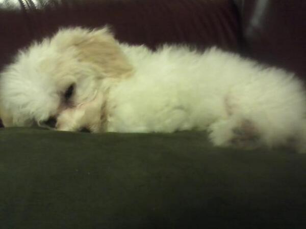
Photo Inspiration: My family bought a new dog
This is the newest member of the Greiff family. He doesn't have a name yet, but we are taking suggestions.
He is a bichon frise and weighs about 4 lbs.
I can't wait to meet him after graduation!

He is a bichon frise and weighs about 4 lbs.
I can't wait to meet him after graduation!

You Can't Miss: A Show and Tell for Designers
Have you heard of Dribble? I was reading a profile piece on a designer, and she said she gets some inspiration from Dribble.com, a site where designers can post projects they are working on. You can get feedback and show your design process. Also, there are job postings for designers on the site. Not bad, eh?
Tuesday, April 30, 2013
Photo inspiration: the Bahamas
My sister went to the Bahamas last week, and she posted this photo on facebook. I am pretty sure this is a view from a restaurant she went to, and it is absolutely stunning.
I am going to have to picture this during the final weeks of school.
 |
| Beautiful Nassau |
Response: Faith Cover Design Contest
So this week is round 2 of the Faith covers, and I am sure everyone will bring something unique and interesting to the mix. I have to say, it was overwhelming seeing all of the options up there, but it was also pretty cool to see how many people chose the same photos or styles. I think there must be something good about your photo choice if several other people chose the same photo (and sometimes the same crop).
As for my own Faith designs, I think I am probably going to elaborate on one of the photos. The last I heard of the feature was that only four or so of the stories are running in print, so using one of the profile shots of the subjects would be a logical way to go.
As for my own Faith designs, I think I am probably going to elaborate on one of the photos. The last I heard of the feature was that only four or so of the stories are running in print, so using one of the profile shots of the subjects would be a logical way to go.
Critique: Websites
Today we looked over everyone's websites in their complete forms. I enjoyed seeing everyone's designs arranged so professionally, and it gave me some ideas on how to improve my own site.
Between last Tuesday and today, I made a lot of changes, including adding a logo, an extra category, and generally changing little details.
Here is the before and after:
 |
| Here is my previous version of my site. It wasn't quite finished yet. |
 |
| Here is the present version of my site. It looks a lot more professional and ready for people to see it, in my opinion. |
You Can't Miss: the Pick Me Up Festival
Eye Magazine's blog posted about the Pick Me Up Festival in London's Somerset House. According to the article, the festival is "a mixture of international illustrators, graphic novelists, cartoonists and graphic designers.
Check it out.
Check it out.
 |
| Rob Flowers' art will be featured at the festival. Here is one of his Illustrations, courtesy of Eye Magazine's blog. |
Wednesday, April 24, 2013
Earth Day Photo Inspiration
In late tribute to Earth Day, here is a photo of the Bullitt Center in Seattle. The building, which opened two days ago, will have to "pass a year of auditing to prove compliance with a set of rigorous
sustainability standards, including self-sufficiency in energy and
water" in order to pass the Living Building Challenge.
Photo and information found on http://news.nationalgeographic.com/news/2013/04/pictures/130419-extreme-green-building/#/earth-day-green-buildings-bullitt_66483_600x450.jpg

Photo and information found on http://news.nationalgeographic.com/news/2013/04/pictures/130419-extreme-green-building/#/earth-day-green-buildings-bullitt_66483_600x450.jpg
Response: Websites
We looked at each others' sites for the first time on Tuesday, along with our first drafts of portfolios.
There was a lot of variation in style and tone on the sites, and it definitely helped inspire me to make some changes on my own site, http://cargocollective.com/feliciagreiff. I recently upgraded my site, and I intend on learning some CSS to get me to a more finished, polished look. Since yesterday, I have added my logo (a work in progress).
I began thinking about what employers are looking for when they peruse designers' sites. I'm sure the most important part is that the work is easy to get to and see, but there are other concerns like branding and style. As this is my first site draft, it is low on style for now. But in the next few months, I'm going to develop it and hopefully get it to a place that makes me really stand out.
Critique: Portfolios
On Tuesday we looked at each other's outlines for print portfolios. The examples I saw looked like they were definitely on the path to being professional, sleek books. My mockup was very rough, but I received some helpful tips as well.
Being in a class of twenty-some designers is incredibly helpful when you are planning your first print portfolio, as I am. Who better to critique and look at your designs and layouts of your work than your classmates, who are all in the same boat?
Here are some things that struck me as important:
1) Put your designs in context of the project they came from, and explain why you included it.
2) Let everything breath by including a few white pages and splash pages.
3) Tease to your website or contact info somewhere in the book.
And, of course, use high-res!
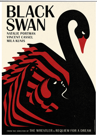
You Can't Miss: La Boca
Eye Magazine recently did a profile on "La Boca," a London-based design company that is celebrating its tenth anniversary in Nantes, France. The exhibition celebrating the colorful designs of the company is called ‘Graphisme Utopique, Architecture Radicale.'
Here are a couple of samples from La Boca, including its famous takes on "Black Swan." These images are from La Boca's website, http://site.laboca.co.uk/. It is definitely worth a look!


Here are a couple of samples from La Boca, including its famous takes on "Black Swan." These images are from La Boca's website, http://site.laboca.co.uk/. It is definitely worth a look!

Wednesday, April 17, 2013
Response: Presentations
Our class presentations have made me wonder about magazines that have recently redesigned. It's a part of the magazine industry that occasionally gets vilified, but it's necessary.
Other than the New Yorker's rebranding, I wasn't really informed about other magazines that have recently undergone changes. Good Housekeeping and Bloomberg Businessweek have redone their mastheads, but what else?
It seems Ebony, The Atlantic, Self, and The New Republic have all undergone style changes as well, and on a more significant level than just a masthead change. These publications are more and more concerned with creating a cohesive style across platforms.
Here is an excerpt from an article about The Atlantic's redesign from author Robert Newman of Foliomag.com:
"The Atlantic’s new look is bright, engaging, modern, and very accessible. There are lots of graphic points of entry, elegant use of typography, rules, and white space, and smart illustrations. Most importantly, it’s all highly readable; there’s no doubt, even with the heightened design, that the text and imagery are given primacy.
Crooks says, “We wanted to do something that was energetic and had more visual impact, that was more reader-friendly, with added entry points and color. At the same time, I wanted to do something that was on brand. I didn’t want the design to be a distraction or too trendy.”
Critique: Three Martini Covers
This week, cover group 2 presented covers for the Three Martini Lunch feature.
These were our only drafts, as the first drafts were just ideas for a shoot, so we were supposed to make them look as finished as possible. I spent more time than usual deciding on fonts, and I'm overall pleased with my choices.


These were our only drafts, as the first drafts were just ideas for a shoot, so we were supposed to make them look as finished as possible. I spent more time than usual deciding on fonts, and I'm overall pleased with my choices.


Inspiration: My recent bookmarks
To mix up my usual inspiration content this week, I thought I would share some recent blogs that I have bookmarked. Whether it's for beautiful photography, fashion, or design, I love to discover sites that make me think about visuals.
Here are a few from this week:
http://www.parkandcube.com/
- This is a fashion one I like with some how-tos.
http://www.colorschemer.com/online.html
- This site lets you enter RGB values and gives you a list of complements. So handy!
http://www.arestlesstransplant.com/
- This is the blog of a dude who quit his job to take his van around the U.S. Beautiful stories and photos.
http://postgradchic.blogspot.com/
- This is a style blog for anyone wondering how to transition from college clothes to real-world clothes. I haven't gotten a chance to peruse much yet.
http://geometrydaily.tumblr.com/
- Your daily dose of geometry.
I hope you enjoy & are inspired.
You Can't Miss: Eye Magazine's latest
Eye Magazine's blog has yet another gem in store for its readers: a preview of a conference held by Alliance Graphique Internationale, or AGI.
According to the post,
According to the post,
"AGI was founded in 1951 as an elite club for designers and illustrators who saw the organisation as a way of sharing common interests and forging friendships across national and cultural borders."There are many high-profile graphic artists and designers from all over the world who attend the AGI Open, and they are the best of the best. Here is a taste of some of their work, as seen on Eye Magazine:
 |
| "Marian Bantjes Christmas ‘Puzzle Series’ cover for theGuardian’s G2 section," courtesy of Eye Magazine's blog |
Wednesday, April 10, 2013
Inspiration: Design with Food
Someone decided to rework classic art using bacon/sauce/seeds/eggs/other.
Check it out.
Check it out.
 |
| Credit: http://thedesigninspiration.com/articles/31-days-of-creativity-with-food/ |
Critique: Cover Stuff
This is going to be more of a nontraditional critique because I didn't present covers on Thursday (not all of the materials were in yet).
Here's one person's take on brainstorming for a magazine cover.
Here are a bunch of cool/weird/different conceptual magazine covers.
Here are the nominees for SPD's magazine of the year award, all of which had conceptual covers.
And finally, here are Ellen DeGeneres' ideas for her "O Magazine" cover.
Here are the nominees for SPD's magazine of the year award, all of which had conceptual covers.
And finally, here are Ellen DeGeneres' ideas for her "O Magazine" cover.
You Can't Miss: Teaching Designers to Write
At the University of Missouri J School, magazine designers have to go through rigorous writing classes in addition to design classes. Eye Magazine's blog featured a post about incorporating more writing into design education.
"Blunt: Explicit and Graphic Design Criticism Now" is a design conference held in Norfolk, Va., beginning April 12. Here is an excerpt from the Eye Magazine blog post:
"Blunt: Explicit and Graphic Design Criticism Now" is a design conference held in Norfolk, Va., beginning April 12. Here is an excerpt from the Eye Magazine blog post:
‘We feel that criticism and writing have played vital roles throughout education, and design is past due’, says FitzGerald. His aim for the conference is to ‘gauge the state of writing and criticism, and to put it in the foreground of the design discipline. We hope attendees will be gratified at what is being accomplished and be hungry for more either by actively promoting critical writing or performing it.’If you are interested in writing and design, be sure to check out the work of John Jennings and Eric Benson called "DeZombies and the Coming Design Apocalypse."
 |
| "DeZombies" cover. Courtesy of http://www.academia.edu/3063216/DeZombies_and_the_Coming_Design_Apocalypse |
Response: Trends Assignment
When I did my interview with Inside Columbia for the trends assignment, I gained some insights into the city magazine industry. One of the most telling moments was when I asked Carolyn Preul, creative director of Inside Columbia, if she spends a lot of her off-hours brainstorming for work. She quickly replied that she absolutely does spend a lot of her free time working and thinking of solutions to problems, design and otherwise.
It's a fair assumption that most people in the magazine industry – city magazines, nonprofit magazines, hyperlocal magazines, and national consumer magazines – all devote a good chunk of free time to work-related stuff. At my last internship, I worked at a nonprofit, where it wasn't uncommon to see one person completing tasks that were completed by several employees in easier times. I guess the takeaway here is to work at a publication that you really love and enjoy because it's likely you'll need to devote more than just the day hours to it.
It's a fair assumption that most people in the magazine industry – city magazines, nonprofit magazines, hyperlocal magazines, and national consumer magazines – all devote a good chunk of free time to work-related stuff. At my last internship, I worked at a nonprofit, where it wasn't uncommon to see one person completing tasks that were completed by several employees in easier times. I guess the takeaway here is to work at a publication that you really love and enjoy because it's likely you'll need to devote more than just the day hours to it.
Tuesday, April 2, 2013
Inspiration: The Designer's Color Guide
If you still struggle with complements and such, check out this site.
In addition to showing the wheel, the site gives fun facts about colors (ex: George Washington's favorite color was green).
In addition to showing the wheel, the site gives fun facts about colors (ex: George Washington's favorite color was green).
 |
| Facts about blue. Credit: http://visual.ly/color-guide-designers |
Response: Jack. Presentations
Yesterday the Jack. group presented to the publishers. I think the publishers were really excited about the outcome, and that is due in large part to the formatted, unified look that Will came up with. Everyone in the group has put in great effort to decide the style and personality of Jack., and I think we are off to a great start. Because we have such a nice product to start off, I think our finished product will be that much better.
Jack. was designed in an iPad edition, a website, and a cookbook supplement. I don't have pdf's or links right now, but I will be adding them later so you can check out our progress so far.
Jack. was designed in an iPad edition, a website, and a cookbook supplement. I don't have pdf's or links right now, but I will be adding them later so you can check out our progress so far.
Critique: Martini Covers round 1
The first round of the "Three Martini Lunch" covers were due on Monday. I haven't gotten feedback on them yet, but I thought I would talk about the process and show two of the ones I submitted.
I didn't really mess with the typography very much, so that would obviously need some work. We were told to focus on photography ideas so we can do a shoot, so both of these ideas would be for the studio.
The first would be at a restaurant booth, just seeing the back of some people as they enjoy a Three Martini Lunch. We don't usually use studio shots of people on the cover (I can't think of any except for T/F and one winter issue with a girl modeling a scarf) so this would be out of the ordinary. The second one is a combination of several photos. The idea there would be that there are several more martinis on the table/sort of a decadent, indulgent vibe.
Here they are:
You Can't Miss: Typography from Melbourne
Stephen Banham, an Australian typographer and writer, recently released a book called "Characters:
Cultural stories revealed through typography." The book is photo-rich with details about Melbourne's typographical past and heritage.
Here is a highlight from Eye Magazine's post about the book:
Cultural stories revealed through typography." The book is photo-rich with details about Melbourne's typographical past and heritage.
Here is a highlight from Eye Magazine's post about the book:
"Though many of the pleasures the book delivers are specifically Melburnian, it will not be hard for city dwellers in other parts of the world to come up with their own counterparts to the decayed subterranean arcades pictured here, to the buildings with carved Edwardian lettering peeking from behind modern plastic details, to the factories whose industrial iconography has been co-opted by property developers as post-industrial retro-chic."As someone interested in visiting Australia, it seems there's one more reason to make the trip: beautiful typography and design.
 |
| Here is a photo from Eye Magazine's post. This sign was made in 1950. |
Wednesday, March 20, 2013
Critique: Route 66 Covers
I actually presented these covers last week, but there was nothing new for this week (just yet), so I am posting them now. These photos all belong to Stuart Palley, the photographer who travelled along Route 66.


Response: The September Issue
I saw "The September Issue" for the first time yesterday. It was a fascinating glimpse into the world of fashion magazines. Everything seems so glazed and perfected to-the-detail, so it was surprising to find out that many decisions happen at the last minute and in a rush. I interned at a magazine a year ago, and the two final weeks of production were usually a frenzy of work and last-minute problems as well, so maybe this is just a fact of life at any magazine.
One compelling dynamic was the relationship between Anna and Grace. Grace is portrayed at the romantic who works because she genuinely loves the escapist, make-believe aspect of fashion. She is the passionate side, and Anna is the chopper, the one who cuts content and lays down the law. I know that Grace rose to fame after this movie, and rightfully so, as her work has been invaluable to the magazine over the years. Still, I was more interested in the inaccessible editor, who is a genius in her own right. In an industry that doesn't get much respect, Anna Wintour repeatedly makes decisions that drive things forward and allow people to have jobs. She's also a woman making big decisions in the magazine industry, where men still hold many of the powerful roles, and that's a very cool thing.
I'd love to see a follow-up doc on Vogue.
You Can't Miss: Sign Painters
Eye Magazine's blog posted about a book featuring sign painters this week.
I went to the book's site and took a few screen caps of a preview. There are some beautiful examples of hand-painted typography on there, as well as some wise old gems about design.

I went to the book's site and took a few screen caps of a preview. There are some beautiful examples of hand-painted typography on there, as well as some wise old gems about design.
 |
| Here's a spread from the book, Sign Painters. Read the pull quote! |
 |
| Hand-painted signs that look vintage. Not sure if they are. Credit: Sign Painters by Faythe Levine and Sam Macon. |
Inspiration: A New Take on Traditional Chinese Paintings
I was reading Slate this week and came across these beautiful paintings. The artist Yao Lu uses "conflict to create harmony" in an exhibit called "New Landscapes."
Basically, he took photos of landfills and digitally altered them to look like traditional Chinese landscape paintings. It's captivating but also disturbing. Definitely go read the entire post at Slate.
Basically, he took photos of landfills and digitally altered them to look like traditional Chinese landscape paintings. It's captivating but also disturbing. Definitely go read the entire post at Slate.
 |
| Yao Lu's "Ancient Springtime Fey." 2006. Credit: Slate Magazine |
Wednesday, March 13, 2013
Inspiration: NYT new site design
As you probably have heard, the NYT is launching its new website design soon, saying it will be cleaner and easier to navigate. It's an exciting time to be a NYT reader.

 |
| Credit: The New York Times |
You Can't Miss: Node Weaving
This week on Eye Magazine's blog, an exhibit showing collaborations between Western designers and craftspeople from Nepal was featured. There are some really beautiful results. Here are some of the highlights:
 |
| A beautiful print on an illustrated carpet by Micah Lidberg. Credit: Eye Magazine's blog. |
 |
| A pattern by Serge Seidlitz. Credit: Eye Magazine's blog. |
Response: Portfolio Talk
I was looking for some inspiration for my online portfolio. Here's what I found:
Here is a cool example of a site for someone who has multiple types of work to display.
Here is a very cool online portfolio. I like the three columns.
Here's a beautiful black-and-white design from a fashion and portrait photographer, Lachlan Bailey.
Enjoy!
Critique: After Dark design
Here are two of four of the spreads from my "After Dark" design. These aren't from the final version, but they are pretty close to it. The awkward spacing issues were resolved with more diversity of type and by using little tags for the reader to identify the story.
Tell me what you think!


Wednesday, March 6, 2013
Inspiration: True/False
I spent a lot of time at Jesse this weekend, tearing ticket stubs and pointing to restrooms. While spending the day around True/False coordinators, supporters, and other volunteers, I looked at a lot of True/False art. There was an overall bee hive/tree theme for the passes, and there was a weird (but cool) house on stilts theme for other aspects of their media. The simple but powerful True/False logo is a classic.
 |
| Logo |
 |
| Volunteer pass |
You Can't Miss: Objects of Desire
Eye Magazine's blog did a post about an exhibit in Milan called, "Kama. Sesso e Design." It features representations of sexual fetishes in Modernist style.
According to the curator, Silvana Annicchiarico, previous artists never addressed the fact that sexuality could be found in everyday objects because it was taboo at the time. That period of prudishness is certainly over where this exhibit is concerned. Check out the rest of Eye Magazine's post about this exhibit for more less-than-subtle references to sexuality.
 |
| Found on EyeMagazine's blog, here is an image of the Modernist exhibit. |
Critique: Portfolio Review
Yesterday we reviewed everyone's work in class. It was interesting to see how each person's style showed through their collection of designs, and I was very impressed. We have a talented group of people in the class.
I haven't reviewed my comments yet, but I am interested in what people think of my work, as well as what should make it in my portfolio.
I haven't reviewed my comments yet, but I am interested in what people think of my work, as well as what should make it in my portfolio.
Response: True False
Last weekend was a crazy one; I volunteered at T/F, went to a classical music concert, and did a ton of homework on the side. Little sleep was had. That said, it was a fantastic time. I saw several documentaries. My favorite was probably "Crash Reel," the story of Kevin Pearce, a professional snowboarder who sustained a traumatic brain injury in 2009. He slowly regained the ability to walk, talk, and live a normal life, but he'll probably never snowboard professionally again. It was hard to watch as Kevin realized he wasn't able to do the same things, but the support of his family and friends made this documentary the most moving and inspirational thing I have seen in a while. Go see it/Netflix it.
Tuesday, February 26, 2013
Response: Jack or Jack Knife?
Jack
Jack Knife.
Jacknife
Jack Knife
The possibilities seem endless. After showing the publishers our work on Monday, there was a little disagreement about the name of the proposed publication. The publishers thought the name "Jack" would get confused with a ladmag. The designers (overall) thought "Jack Knife" alluded to an outdoorsy meaning that we were not trying to go for.
So I did a little more research than I had before on the title.
1) Here is one Jack Magazine, a defunct literary journal that put out its last issue in 2010.
2) Here is another Jack Magazine. This one is a bilingual culture magazine based in Colombia.
3) The lad mag that the publishing group referred to has been out of print since 2004, according to its wikipedia entry.
4) There is also an Italian tech magazine called Jack.
I understand the desire to find a name that is original, but a lot of these past Jacks are out of print or foreign-based. I really like the simplicity and association with the name Jack, so it still has my vote.
You Can't Miss: post-apocalyptic art
This week, I picked an Eye Magazine blog post about artists and designers who worked together on an exhibit. The exhibit is centered around a story by Hari Kunzru. It takes place in a future London that has no infrastructure:
Check it out.
"The resulting social breakdown has led to a dark age, a world where writing and the very act of remembering is banned by those in charge. The central character is in prison, a member of an illegal group who practice the ‘art of memory’ to try and preserve as much of the past as they can."As you can imagine, the art is strange and dark. Like most futuristic art, it tries to reveal something about the world as it exists in the present.
Check it out.
Inspiration: The Gentlewoman
The Gentlewoman usually gets fabulous, interesting people on its covers, so it was no surprise that Beyonce was featured in its most recent issue. The magazine's format is a good example of how clean, simple design can have a huge impact. They are selling the magazine 100% on Beyonce's celebrity. There's hardly any text; note the lack of cover lines.

Critique: Jack Designs
On Monday we presented our "Jack Knife" designs to the publishers. I shortened my nameplate to just "Jack," but otherwise stuck with the same direction and personality that the publishers wrote out. Here is the edited version of my design:

This is the cover. I cut out the nameplate using Impact and some green wood texture I found. I thought the texture could change with every issue to keep it fresh.

Here is a detail of some succulent-looking short ribs. I figure men as well as women like images that appeal to the senses.

Sean Connery used to promote Jim Beam, so I thought his presence would add to the manly factor.

Here's the feature. 3 x 3 grid on the left, and a simple head in Impact on the right.
The presentation with the publishers went well, I thought. Everyone in my group brought really appealing, though-out designs, and I'm sure the publishers will have a hard time making up their minds. Well done, everybody!
Wednesday, February 20, 2013
Response: Talking about Designs
Designing a cover, spread, and department page based on the publishing class's ideas was a challenge. Their ideas were fresh and exciting, but there is a lot of narrowing-down to be done.
That being said, the critique portion of the class was really useful so far. Getting feedback from everyone on paper will be invaluable for sure. One really helpful thing about doing critiques with Jan has been her specificity. In class, we often try to tell each other when something could be improved, which is great, but Jan seems to pinpoint what could change and offer a suggestion with it. I really like this method of critique because it is solution-based. Perhaps the whole class could adopt this method in our weekly critiques to make the sessions even more valuable.
That being said, the critique portion of the class was really useful so far. Getting feedback from everyone on paper will be invaluable for sure. One really helpful thing about doing critiques with Jan has been her specificity. In class, we often try to tell each other when something could be improved, which is great, but Jan seems to pinpoint what could change and offer a suggestion with it. I really like this method of critique because it is solution-based. Perhaps the whole class could adopt this method in our weekly critiques to make the sessions even more valuable.
You Can't Miss: Stunning Valentine's Cards
This week's favorite post from Eye Magazine's blog is about an artist's take on the Valentine. Canadian designer Marion Bantjes is famous for her laser-cut designs, hand-drawn scripts, and overall beautiful details.
Here's an excerpt from a past Eye Magazine interview with Bantjes:
These cards even impress those at a design magazine who probably have a low threshold for the cliche and cheesy, so you know they have to be well-executed. Check out Bantjes' site for more.
Here's an excerpt from a past Eye Magazine interview with Bantjes:
"Design magazines don’t receive Valentine’s Day cards as a rule. Sure, we get plenty of Christmas cards. And even more New Year’s cards and fancy calendars, from all those design studios who didn’t quite hit their Christmas deadline. But 14 February always seemed too . . . arbitrary, too commercialised and/or too personal. Until Marian Bantjes came along."
 |
| One of Bantjes' 2013 Valentines. Credit: Eye Magazine's blog. |
 | |||
| Photo Credit: Eye Magazine's blog (http://www.eyemagazine.com/blog/post/whos-writing-this-script) |
Inpiration: Esquire typography cover

Here is Esquire's most recent cover about the man who killed Osama Bin Laden. Apparently, the feature article is 15, 000 words, so it's definitely a "lean back" piece. It's an account of the SEAL team, and a look at what comes next. I wanted to draw attention to the typeface and head-on quality of the cover. When I saw this cover at the bookstore, I stopped to get a closer look. You can't use this kind of in-you-face approach on every cover, but when you do, it gets a second look from viewers.
Critique: Cecil Estes covers


This critique was interesting because I think everyone's covers came out really differently. We all took specific directions with our tone, colors, fonts, and concepts. I think it's a really valuable thing when everyone can come together and look at the various concepts.
Subscribe to:
Comments (Atom)